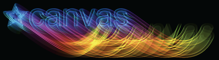
<canvas> brings Javascript programmers full-control of the colors, vectors and pixels on their screens—the visual makeup of the monitor.
<canvas> brings Javascript programmers full-control of the colors, vectors and pixels on their screens—the visual makeup of the monitor.
The following examples deal with one area in <canvas> that hasn’t gotten much attention; creating text-effects. The variety of text-effects that can be created in <canvas> are as vast as you can imagine—these demos cover a sub-section of what is possible. Although we’re dealing with “text” in this article, the methods can be applied to any vector objects; creating exciting visuals in games, and other applications:
CSS uses two methods; box-shadow for box-elements, such as div, span, and so on; and text-shadow for text content.
<canvas> has one type of shadow; it’s used for all the vector objects; ctx.moveTo, ctx.lineTo, ctx.bezierCurveTo, ctx.quadradicCurveTo, ctx.arc, ctx.rect, ctx.fillText, ctx.strokeText, and so on. To create a shadow in <canvas>, tap into these four properties:
ctx.shadowColor = “red” // string
Color of the shadow; RGB, RGBA, HSL, HEX, and other inputs are valid.
ctx.shadowOffsetX = 0; // integer
Horizontal distance of the shadow, in relation to the text.
ctx.shadowOffsetY = 0; // integer
Vertical distance of the shadow, in relation to the text.
ctx.shadowBlur = 10; // integer
Blurring effect to the shadow, the larger the value, the greater the blur.
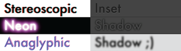
To get things started, let’s see how <canvas> can emulate CSS effects. Searching through Google images for “css text-shadow” led to a few great demos for us to emulate; Line25, and Stereoscopic, and Shadow 3D.
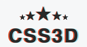
The stereoscopic 3D effect (see Anaglyph image for more) is an example of a simple line of code, put to great use. With the following line of CSS, we can create the illusion of depth when viewed with 3D red/cyan glasses (the kind they give you at 3D movies):
text-shadow: -0.06em 0 0 red, 0.06em 0 0 cyan;
There are two things to notice when converting this string to <canvas>
(1) There is no shadow-blur (the third value), so there is no reason to actually run shadow, as fillText would create the same results:
  var text = “Hello world!”
  ctx.fillStyle = “#000”
  ctx.fillText(text, -7, 0);
  ctx.fillStyle = “red”
  ctx.fillText(text, 0, 0);
  ctx.fillStyle = “cyan”
  ctx.fillText(text, 7, 0);
(2) EM’s aren’t supported in <canvas> so they’ll have to be converted to PX’s. We can find the conversion ratio for converting between PT, PC, EM, EX, PX and so-forth by creating an element with the same font-properties in DOM, and setting the width to the format to be measured; for instance, to capture the EM -> PX conversion, we’d measure the DOM element with a “height: 1em”, the resulting offsetHeight would be how many PX’s are in each EM.
  var font = “20px sans-serif”
  var d = document.createElement(”span”);
  d.style.cssText = “font: “ + font + “ height: 1em; display: block”
  // the value to multiply PX’s by to convert to EM’s
  var EM2PX = 1 / d.offsetHeight;
In a more complex example, such as the Neon effect found on Line25, the shadowBlur property must be used to emulate the effect properly. Since the Neon effect relies on multiple shadows, we run into a problem; in <canvas> each vector object can only have one shadow. So, in order to draw multiple shadows, you must draw multiple versions of the text on top of itself. This results in alpha multiplication, and ultimately jagged edges.
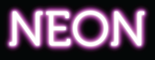
I tried running ctx.fillStyle = “rgba(0,0,0,0)” or “transparent” to hide the text, while displaying the shadow... however, this attempt was futile; since the shadow is a multiplication of the fillStyle alpha, the shadow can never be more opaque than the fillStyle.
Luckily, there is a way around this, we can draw the shadow offset from the text, keeping them separated (so they’re not overlapping), and thereby hiding the text off the side of the screen:
  var text = “Hello world!”
  var blur = 10;
  var width = ctx.measureText(text).width + blur * 2;
  ctx.textBaseline = “top”
  ctx.shadowColor = “#000”
  ctx.shadowOffsetX = width;
  ctx.shadowOffsetY = 0;
  ctx.shadowBlur = blur;
  ctx.fillText(text, -width, 0);
To clean this up a bit we can prevent the fillText from being drawn in the first place (while allowing the shadow to be drawn) by adding a clipping path. In order to create a clipping path surrounding the text, we need to know the height of the text (called the “em-height” historically the height of the letter “M” on a printing press), and the width of the text. We can get the width using ctx.measureText().width, however, ctx.measureText().height doesn’t exist.
Luckily, through CSS hack-ardry (see Typographic Metrics for more ways to fix older implementations of <canvas> using CSS measurements), we can find the height of the text through measuring the offsetHeight of a <span> with the same font-properties:
  var d = document.createElement(”span”);
  d.font = “20px arial”
  d.textContent = “Hello world!”
  var emHeight = d.offsetHeight;
From there, we can create a rectangle to use as a clipping path; enclosing the “shadow” while removing the dummy-shape.
  ctx.rect(0, 0, width, emHeight);
  ctx.clip();
Tying it all together, and optimizing as we go—if a shadow has no blur, fillText can be used to the same effect, saving us from setting up the clipping mask:
  var width = ctx.measureText(text).width;
  var style = shadowStyles[text];
  // add a background to the current effect
  ctx.fillStyle = style.background;
  ctx.fillRect(0, offsetY, ctx.canvas.width, textHeight - 1)
  // parse text-shadows from css
  var shadows = parseShadow(style.shadow);
  // loop through the shadow collection
  var n = shadows.length; while(n--) {
	  var shadow = shadows[n];
	  var totalWidth = width + shadow.blur * 2;
	  ctx.save();
	  ctx.beginPath();
	  ctx.rect(offsetX - shadow.blur, offsetY, offsetX + totalWidth, textHeight);
	  ctx.clip();
	  if (shadow.blur) { // just run shadow (clip text)
		  ctx.shadowColor = shadow.color;
		  ctx.shadowOffsetX = shadow.x + totalWidth;
		  ctx.shadowOffsetY = shadow.y;
		  ctx.shadowBlur = shadow.blur;
		  ctx.fillText(text, -totalWidth + offsetX, offsetY + metrics.top);
	  } else { // just run pseudo-shadow
		  ctx.fillStyle = shadow.color;
		  ctx.fillText(text, offsetX + (shadow.x||0), offsetY - (shadow.y||0) + metrics.top);
	  }
	  ctx.restore();
  }
  // drawing the text in the foreground
  if (style.color) {
	  ctx.fillStyle = style.color;
	  ctx.fillText(text, offsetX, offsetY + metrics.top);
  }
  // jump to next em-line
  ctx.translate(0, textHeight);
Since you’re not going to want to enter all these <canvas> commands manually, I’ve included a simple text-shadow parser in the demo source; this way you can feed it CSS commands and have it generate <canvas> commands. Now, our <canvas> elements have a whole range of styles it can tie into. These same shadow-effects can be used on any vector object, from WebFonts to complex shapes imported from SVGs, to generative vector shapes, and so on!
View Text-Shadows in <canvas> effects.
In writing this section of the article, the Stereoscopic example made me curious. How hard it would be to create a 3D-movie-screen effect using <canvas> and two images taken from slightly different perspectives? Apparently, not too hard. The following kernel combines the red channel of the first image (data) w/ the cyan channel of the second image (data2):
  data[i] = data[i] * 255 / 0xFF;
  data[i+1] = 255 * data2[i+1] / 0xFF;
  data[i+2] = 255 * data2[i+2] / 0xFF;
Visit the Stereoscopic demo to see how to create images to be enhanced with 3D glasses (cyan/magenta). Now, someone just needs to duct-tape two iPhones to their forehead, click “record video” at the same time, and we could make our own 3D movies in HTML5. Any volunteers?
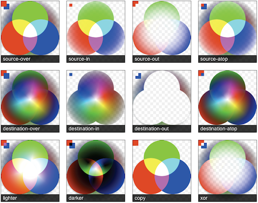
The globalCompositeOperation chart shows GCO modes at work; this chart uses a large portion of the color-spectrum and multiple levels of alpha transparency in order to see in detail what to expect. I would recommend checking out Mozilla’s globalCompositeOperation reference for textual descriptions. For further research, you can learn how the operations work in Porter Duff’s Compositing Digital Images.
My favorite mode is globalCompositeOperation=”lighter”. Lighter mixes the appended pixels similar to how light mixes; when red, green and white light are at full-intensity, we see white-light. It’s a exciting feature to play around with, especially when the <canvas> is set to a low globalAlpha; enabling finer control, and smoother edges. Lighter has been put to many uses, my recent favorite being a HTML5 desktop background creator found at http://weavesilk.com/. One of my demos, Breathing Galaxies (JS1k), also uses the lighter mode—drawing patterns from these two examples you start to see what effect this mode yields.
NOTE: There is some missing support for some of the GCO modes across the browsers that needs to be sorted out. There are six-modes that work across browsers (in Chrome, Safari, Firefox, and Opera): source-over, source-atop, destination-over, destination-out, lighter, and xor. Hopefully this will be sorted out in coming releases, for more information visit globalCompositeOperation browser handling.
In the following demo, we’re going to achieve a Photoshop-like neon-rainbow-glow with a jittered outline, by chaining effects together using the globalCompositeOperation (source-in, lighter, and darker). This demo is a progression of the “Text-Shadows in <canvas>” demo, using the same strategy in separating the shadow from the text (see previous section):
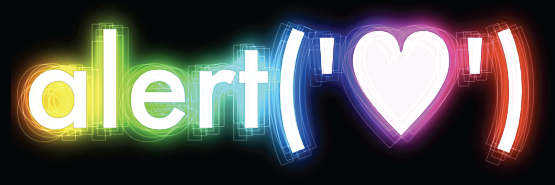
View Neon-Rainbow Jitter effect.
function neonLightEffect() {
	var text = "alert('"+String.fromCharCode(0x2665)+"')";
	var font = "120px Futura, Helvetica, sans-serif";
	var jitter = 25; // the distance of the maximum jitter
	var offsetX = 30;
	var offsetY = 70;
	var blur = getBlurValue(100);
	// save state
	ctx.save();
	ctx.font = font;
	// calculate width + height of text-block
	var metrics = getMetrics(text, font);
	// create clipping mask around text-effect
	ctx.rect(offsetX - blur/2, offsetY - blur/2, offsetX + metrics.width + blur, metrics.height + blur);
	ctx.clip();
	// create shadow-blur to mask rainbow onto (since shadowColor doesn't accept gradients)
	ctx.save();
	ctx.fillStyle = "#fff";
	ctx.shadowColor = "rgba(0,0,0,1)";
	ctx.shadowOffsetX = metrics.width + blur;
	ctx.shadowOffsetY = 0;
	ctx.shadowBlur = blur;
	ctx.fillText(text, -metrics.width + offsetX - blur, offsetY + metrics.top);
	ctx.restore();
	// create the rainbow linear-gradient
	var gradient = ctx.createLinearGradient(0, 0, metrics.width, 0);
	gradient.addColorStop(0, "rgba(255, 0, 0, 1)");
	gradient.addColorStop(0.15, "rgba(255, 255, 0, 1)");
	gradient.addColorStop(0.3, "rgba(0, 255, 0, 1)");
	gradient.addColorStop(0.5, "rgba(0, 255, 255, 1)");
	gradient.addColorStop(0.65, "rgba(0, 0, 255, 1)");
	gradient.addColorStop(0.8, "rgba(255, 0, 255, 1)");
	gradient.addColorStop(1, "rgba(255, 0, 0, 1)");
	// change composite so source is applied within the shadow-blur
	ctx.globalCompositeOperation = "source-atop";
	// apply gradient to shadow-blur
	ctx.fillStyle = gradient;
	ctx.fillRect(offsetX - jitter/2, offsetY, metrics.width + offsetX, metrics.height + offsetY);
	// change composite to mix as light
	ctx.globalCompositeOperation = "lighter";
	// multiply the layer
	ctx.globalAlpha = 0.7
	ctx.drawImage(ctx.canvas, 0, 0);
	ctx.drawImage(ctx.canvas, 0, 0);
	ctx.globalAlpha = 1
	// draw white-text ontop of glow
	ctx.fillStyle = "rgba(255,255,255,0.95)";
	ctx.fillText(text, offsetX, offsetY + metrics.top);
	// created jittered stroke
	ctx.lineWidth = 0.80;
	ctx.strokeStyle = "rgba(255,255,255,0.25)";
	var i = 10; while(i--) {
		var left = jitter / 2 - Math.random() * jitter;
		var top = jitter / 2 - Math.random() * jitter;
		ctx.strokeText(text, left + offsetX, top + offsetY + metrics.top);
	}
	ctx.strokeStyle = "rgba(0,0,0,0.20)";
	ctx.strokeText(text, offsetX, offsetY + metrics.top);
	ctx.restore();
};
The Zebra Reflection effect was inspired by WebDesignerWall’s excellent resource on how to spice up your page with CSS. This takes the idea a little bit further, creating a “reflection” for the text—such as what you might see in iTunes. The effect combines the fillColor (white), createPattern (zebra.png), and linearGradient (shine); this illustrates the ability to apply multiple fill types to each vector object:
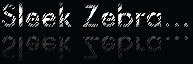
View Zebra Reflection effect.
function sleekZebraEffect() {
	// inspired by - http://www.webdesignerwall.com/demo/css-gradient-text/
	var text = "Sleek Zebra...";
	var font = "100px Futura, Helvetica, sans-serif";
	// save state
	ctx.save();
	ctx.font = font;
	// getMetrics calculates:
	// width + height of text-block
	// top + middle + bottom baseline
	var metrics = getMetrics(text, font);
	var offsetRefectionY = -20;
	var offsetY = 70;
	var offsetX = 60;
	// throwing a linear-gradient in to shine up the text
	var gradient = ctx.createLinearGradient(0, offsetY, 0, metrics.height + offsetY);
	gradient.addColorStop(0.1, '#000');
	gradient.addColorStop(0.35, '#fff');
	gradient.addColorStop(0.65, '#fff');
	gradient.addColorStop(1.0, '#000');
	ctx.fillStyle = gradient
	ctx.fillText(text, offsetX, offsetY + metrics.top);
	// draw reflected text
	ctx.save();
	ctx.globalCompositeOperation = "source-over";
	ctx.translate(0, metrics.height + offsetRefectionY)
	ctx.scale(1, -1);
	ctx.font = font;
	ctx.fillStyle = "#fff";
	ctx.fillText(text, offsetX, -metrics.height - offsetY + metrics.top);
	ctx.scale(1, -1);
	// cut the gradient out of the reflected text
	ctx.globalCompositeOperation = "destination-out";
	var gradient = ctx.createLinearGradient(0, offsetY, 0, metrics.height + offsetY);
	gradient.addColorStop(0.0, 'rgba(0,0,0,0.65)');
	gradient.addColorStop(1.0, '#000');
	ctx.fillStyle = gradient;
	ctx.fillRect(offsetX, offsetY, metrics.width, metrics.height);
	// restore back to original transform state
	ctx.restore();
	// using source-atop to allow the transparent .png to show through to the gradient
	ctx.globalCompositeOperation = "source-atop";
	// creating pattern from  sourced
	ctx.fillStyle = ctx.createPattern(image, 'repeat');
	// fill the height of two em-boxes, to encompass both normal and reflected state
	ctx.fillRect(offsetX, offsetY, metrics.width, metrics.height * 2);
	ctx.restore();
};
The following example allows for the inner-shadow and fillStyle to be stylized with color+gradient+pattern simultaneously. You can specify pattern rotation individually; notice the zebra stripes are now perpendicular to each-other. A clipping mask the size of the bounding-box is used removing the need for a super-large container to enclose the cutout shape—improving the speed by preventing the unnecessary parts of the shadow from being processed.
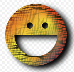
View Inner-shadow effect.
   function innerShadow() {
	   function drawShape() { // draw anti-clockwise
		   ctx.arc(0, 0, 100, 0, Math.PI * 2, true); // Outer circle
		   ctx.moveTo(70, 0);
		   ctx.arc(0, 0, 70, 0, Math.PI, false); // Mouth
		   ctx.moveTo(-20, -20);
		   ctx.arc(30, -30, 10, 0, Math.PI * 2, false); // Left eye
		   ctx.moveTo(140, 70);
		   ctx.arc(-20, -30, 10, 0, Math.PI * 2, false); // Right eye
	   };
	   var width = 200;
	   var offset = width + 50;
	   var innerColor = "rgba(0,0,0,1)";
	   var outerColor = "rgba(0,0,0,1)";
	   ///
	   ctx.translate(150, 170);
	   // apply inner-shadow
	   ctx.save();
	   ctx.fillStyle = "#000";
	   ctx.shadowColor = innerColor;
	   ctx.shadowBlur = getBlurValue(120);
	   ctx.shadowOffsetX = -15;
	   ctx.shadowOffsetY = 15;
	   // create clipping path (around blur + shape, preventing outer-rect blurring)
	   ctx.beginPath();
	   ctx.rect(-offset/2, -offset/2, offset, offset);
	   ctx.clip();
	   // apply inner-shadow (w/ clockwise vs. anti-clockwise cutout)
	   ctx.beginPath();
	   ctx.rect(-offset/2, -offset/2, offset, offset);
	   drawShape();
	   ctx.fill();
	   ctx.restore();
	   // cutout temporary rectangle used to create inner-shadow
	   ctx.globalCompositeOperation = "destination-out";
	   ctx.fill();
	   // prepare vector paths
	   ctx.beginPath();
	   drawShape();
	   // apply fill-gradient to inner-shadow
	   ctx.save();
	   ctx.globalCompositeOperation = "source-in";
	   var gradient = ctx.createLinearGradient(-offset/2, 0, offset/2, 0);
	   gradient.addColorStop(0.3, '#ff0');
	   gradient.addColorStop(0.7, '#f00');
	   ctx.fillStyle = gradient;
	   ctx.fill();
	   // apply fill-pattern to inner-shadow
	   ctx.globalCompositeOperation = "source-atop";
	   ctx.globalAlpha = 1;
	   ctx.rotate(0.9);
	   ctx.fillStyle = ctx.createPattern(image, 'repeat');
	   ctx.fill();
	   ctx.restore();
	   // apply fill-gradient
	   ctx.save();
	   ctx.globalCompositeOperation = "destination-over";
	   var gradient = ctx.createLinearGradient(-offset/2, -offset/2, offset/2, offset/2);
	   gradient.addColorStop(0.1, '#f00');
	   gradient.addColorStop(0.5, 'rgba(255,255,0,1)');
	   gradient.addColorStop(1.0, '#00f');
	   ctx.fillStyle = gradient
	   ctx.fill();
	   // apply fill-pattern
	   ctx.globalCompositeOperation = "source-atop";
	   ctx.globalAlpha = 0.2;
	   ctx.rotate(-0.4);
	   ctx.fillStyle = ctx.createPattern(image, 'repeat');
	   ctx.fill();
	   ctx.restore();
	   // apply outer-shadow (color-only without temporary layer)
	   ctx.globalCompositeOperation = "destination-over";
	   ctx.shadowColor = outerColor;
	   ctx.shadowBlur = 40;
	   ctx.shadowOffsetX = 15;
	   ctx.shadowOffsetY = 10;
	   ctx.fillStyle = "#fff";
	   ctx.fill();
   };
From these examples you can see, using globalCompositeOperation, we can chain-effects together, producing more elaborate effects (utilizing masking and blending). The screen is your oyster ;)
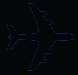
... to this shaded example:
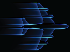
... can be achieved by multiple calls to ctx.strokeText() with a thin lineWidth (0.25), while slowly decreasing the x-offset and alpha; giving our vector elements the feeling of motion.
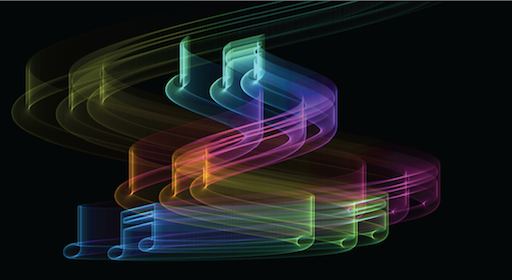
By mapping the elements XY position to a sine/cosine wave, and cycling through colors using the HSL property, we can create more interesting effects, such as this “biohazard” example:
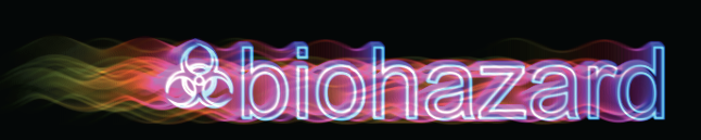
HSL is a newly supported format in the CSS3 specs. Where HEX was designed for computers, HSL is designed to be human readable.
Illustrating the ease of HSL; to cycle through the color-spectrum, we’d simply increment the “hue” from 360; the hue is mapped to the spectrum in cylindric fashion. Lightness controls how how dark/light the color is; 0% indicates a black pixel, whereas 100% indicates a white pixel. Saturation controls how bright or vivid a color is; grey’s are created with a saturation of 0%, and vivid colors are created using a value of 100%.
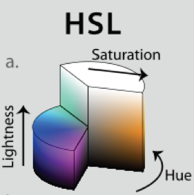
Since HSL is a recent standard, you may wish to continue supporting older browsers, which is possible via color-space conversion. The following code accepts an HSL object { H: 360, S: 100, L: 100} and outputs a RGB object { R: 255, G: 255, B: 255 }. From there, you can use those values to create your rgb or rgba string. For more in depth information see Wikipedia’s insightful article on HSL.
  // HSL (1978) = H: Hue / S: Saturation / L: Lightness
  HSL_RGB = function (o) { //  { H: 0-360, S: 0-100, L: 0-100 }
	  var H = o.H / 360,
		  S = o.S / 100,
		  L = o.L / 100,
		  R, G, B, _1, _2;
	  function Hue_2_RGB(v1, v2, vH) {
		  if (vH < 0) vH += 1;
		  if (vH > 1) vH -= 1;
		  if ((6 * vH) < 1) return v1 + (v2 - v1) * 6 * vH;
		  if ((2 * vH) < 1) return v2;
		  if ((3 * vH) < 2) return v1 + (v2 - v1) * ((2 / 3) - vH) * 6;
		  return v1;
	  }
	  if (S == 0) { // HSL from 0 to 1
		  R = L * 255;
		  G = L * 255;
		  B = L * 255;
	  } else {
		  if (L < 0.5) _2 = L * (1 + S);
		  else _2 = (L + S) - (S * L);
		  _1 = 2 * L - _2;
		  R = 255 * Hue_2_RGB(_1, _2, H + (1 / 3));
		  G = 255 * Hue_2_RGB(_1, _2, H);
		  B = 255 * Hue_2_RGB(_1, _2, H - (1 / 3));
	  }
	  return {
		  R: R,
		  G: G,
		  B: B
	  };
  };
In the past, to create animations in Javascript, there was two choices; setTimeout, and setInterval.
requestAnimationFrame, is the new standard here to replace both; saving the world electricity (and your computer a few heartbeats) by allowing the browser to regulate animations based on available resources. Some important features include:
At the time of writing, vender specific prefixes are required to use requestAnimationFrame. Paul Irish created a shim layer that has cross-vender support, in requestAnimationFrame for smart animating:
    // shim layer with setTimeout fallback
    window.requestAnimFrame = (function(){
      return  window.requestAnimationFrame       ||
              window.webkitRequestAnimationFrame ||
              window.mozRequestAnimationFrame    ||
              window.oRequestAnimationFrame      ||
              window.msRequestAnimationFrame     ||
              function(/* function */ callback, /* DOMElement */ element){
                window.setTimeout(callback, 1000 / 60);
              };
    })();
Taking that a bit further, the more ambitious might tie this together with a poly-fill such as requestAnimationFrame.js (there are a few features to be worked out) that would support older browsers to a further extent, while switching to this new standard.
The following example shows how to create an animation, sending thousands of calls to strokeText through a low alpha without stalling the browser. The controls are a bit strange, but it produces some cool results:
View Spaceage effect.
  (function animate() {
	  var i = 50; while(i--) {
		  if (n > endpos) return;
		  n += definition;
		  ctx.globalAlpha = (0.5 - (n + startpos) / endpos) * alpha;
		  if (doColorCycle) {
			  hue = n + color;
			  ctx.strokeStyle = "hsl(" + (hue % 360) + ",99%,50%)"; // iterate hue
		  }
		  var x = cos(n / cosdiv) * n * cosmult; // cosine
		  var y = sin(n / sindiv) * n * sinmult; // sin
		  ctx.strokeText(text, x + xoffset, y + yoffset); // draw rainbow text
	  }
	  timeout = window.requestAnimationFrame(animate, 0);
  })();
With support from across browser vendor-sphere, there is no question about the future of <canvas> it can be easily ported to the iPhone/Android/Desktop executables using PhoneGap, or Titanium. I’m looking forwards to the future of web-apps, especially interactive infosthetics—the art of making information beautiful, and (hopefully) understandable.
Source-code, and demos inside.
These experiments eventually led to the creation of the startup Mugtug with my long-time friend Charles Pritchard. We’re developing Darkroom in HTML5 <canvas>. Darkroom is a non-destructive photo-sharing app, combining the powers pixel-based image filters with vector-based typography, stamps and brushes. Please visit our Kickstarter page for more information on our project, we could use your help!